
People used to spend days exporting, filtering, and formatting data in Excel earlier. But those days are thankfully long gone. The transition from manual data analysis to automated tools is similar to the switch from horse-drawn carriages to cars – it’s much faster and more efficient.
Nowadays, we have business intelligence software programs that can create dashboards that efficiently display data for easier understanding and decision-making.
Business intelligence software has evolved from manual processes to more sophisticated approaches that leverage platforms, algorithms, and advanced BI tools.
What are BI Dashboard Tools?
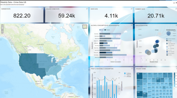
BI dashboard solutions or Business intelligence dashboards turn raw data into business insights. For example, a BI dashboard could take sales data and present it as charts and graphs to show trends and highlight areas of success or failure.
In business intelligence, these technologies are often used to monitor certain metrics and base choices on the most helpful information. BI dashboard technologies can help stakeholders track and evaluate performance metrics and other data.
Effective data visualization can be achieved by combining data into charts, graphs, and reports on a single screen using BI dashboards.
Importance of BI Dashboard Tools
A BI Dashboard is a must-have for any company aiming to increase conversions. With these technologies, businesses can collect information from important datasets and turn it into strategies and actions to enhance business choices.
Modern BI solutions can access, analyze, display, and share data via web-based dashboards. This makes BI dashboards incredibly beneficial for analysts who are manually assembling data.
Dashboards seamlessly link files, APIs, and services to provide end users with a comprehensive view of their metrics and drivers.
BI Dashboards Vs. BI Reports
BI reports and dashboards are frequently confused with one another. All of the data is compiled into a single display in BI dashboards.
They offer performance summaries that are necessary at a glance. Dashboards are far more interactive and can be updated instantly, thanks to cloud-based technologies.
Whereas BI reports offer an in-depth perspective and are excellent for stakeholder communication.
Top BI Dashboard Tools
The following are a few of the most popular business intelligence tools available today:
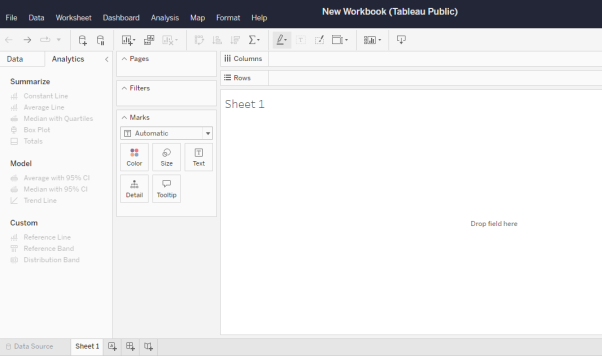
Tableau
Tableau is a business intelligence data visualization software. One of the aspects that makes Tableau so popular is that it does not require any prior programming knowledge, allowing users with no relevant background to create visualizations with Tableau.
Tableau allows you to quickly analyze data and create visualizations such as dashboards and worksheets.
Tableau connects numerous databases and pulls data from them, including advanced databases like Oracle, Excel, and pdf files.
After the data has been retrieved, Tableau enables the user to work on the data visualization process without needing prior programming knowledge, so even non-technical people can use it to carry out operations. The information can then be transformed into dashboards that users can share and view.
Tableau is an excellent choice for business intelligence decisions since it offers crucial insights into the performance indicators that may help decision-making.
Learn more: Tableau
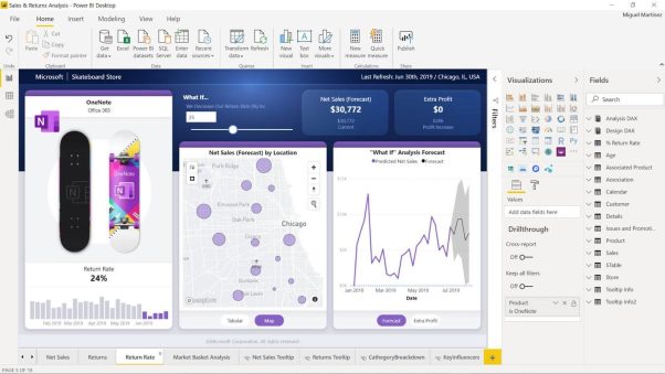
Power BI
Microsoft developed Power BI as a data visualization tool for making business intelligence choices as a component of the Microsoft Power Platform. This operates similarly to Tableau, which translates data into dashboards for insights.
There are Power BI applications available for several platforms. Power BI provides more than 500 free connectors.
Although Power BI does not need coding, it uses the formula language known as DAX, or Data Analysis Expressions, to build calculated columns, measurements, and custom tables.
Power BI’s three main components are 1) Data Integration, 2) Data Processing, and 3. Data Presentation. Data Integration allows you to easily import data from multiple sources, including databases, documents, and other applications. Data Processing allows you to transform the data and clean it up. Data Presentation allows you to create visuals and reports that make it easier to understand and present the data.
Learn more: Microsoft Power BI: Data Visualisation
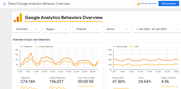
Looker (formerly Google Data Studio)
Looker is an online dashboard creation tool for data visualization, formerly known as Google Data Studio. Looker data sources are a type of connector that connects your report with external data from sources like Google Analytics, Google AdWords, etc. Looker supports over 500+ data sources.
To make your data more understandable, Looker Studio can assist with the visualization of statistics or data into visuals, tables, or charts.
You can add text to the display to clarify specific points, change the fonts and colors to make the data look more appealing, and even add your branding.
Looker studio can be used for various applications to display data for your business, such as linking it to a YouTube account to report the number of video shares, views, average watch time, and more.
Looker, or Google Data Studio, is also an excellent option for non-technical users because it doesn’t require any coding knowledge and has a user-friendly interactive interface.
Learn more: Looker Studio Overview – Google
QlikView
QlikView is a Business Intelligence tool that transforms raw data into knowledge. QlikView allows you to search across all data, both directly and indirectly.
For non-technical users, QlikView’s self-service business intelligence model is excellent. This model simplifies the process of data analysis and visualization, allowing users to explore and analyze data without having to rely on IT professionals or specialized training quickly and easily.
Ad hoc queries are supported by QlikView’s features, which also enable rapid decision-making based on readily available data.
Learn more: QlikView – Powerful Interactive Analytics & Dashboards | Qlik
SAP Lumira
In the same way as the tools mentioned above, SAP Lumira is a tool for data analysis and visualization. SAP Lumira is also marketed as a self-service business intelligence platform.
SAP’s engaging user interface makes it ideal for non-technical users with limited IT skills. It offers universal applicability, allowing you to link data from any source, SAP or not.
The software follows the WYSIWYG idea (“What you see is what you get”). The on-premises Self-Service BI solution offered by SAP is called SAP Lumira Discovery.
Learn more: SAP Lumira | Self-Service Data Visualization & BI
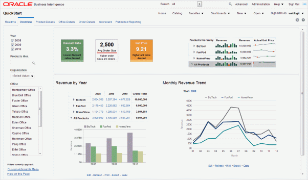
Oracle Business Intelligence
OBIEE (Oracle Business Intelligence Enterprise Edition) is the first integrated end-to-end EPM system and a BI tool.
Oracle BI can collect data from several commercial sources and produce visualizations to show the data in various forms, such as dashboards, charts, and graphs.
Additionally, Oracle BI is self-service, making it simple for non-technical people to learn and utilize.
Learn more: Oracle Business Intelligence
Business Intelligence Software Comparison
Tableau vs. Power BI
While Tableau and Power BI are both excellent data visualization tools, several key distinctions set them apart from one another.
|
Tableau |
Power BI |
|
Tableau uses MDX (Multidimensional Expressions) for dimensions and measurements. |
Calculations in Power BI are made in DAX. |
|
Tableau is well-known for its data visualization features. |
Power BI, on the other hand, is well-known for providing multiple data points for data visualization. |
|
Tableau is capable of handling huge datasets with high performance. |
Power BI can perform well with a limited data set. |
|
Tableau is often great for experienced users. |
Whereas Power BI is good for both technical and non-technical users. |
|
Tableau is difficult in terms of usability. |
Power BI is simple to use and learn. |
|
Tableau servers can be used to store the data. |
Power BI focuses on reporting and analytical modeling rather than data storage. |
|
Tableau is an expensive tool. The basic Creator package is $70 per user each month, billed annually. |
Power BI is less expensive than Tableau; Power BI Pro costs $13.70 per user per month. |
|
In terms of deployment, Tableau is available: – On Cloud – On-premise – On Linux – On Mac – On Windows |
Power BI is available: – On Cloud – On-premise – Windows |
Looker vs. QlikView
Looker and QlikView are data visualization and business intelligence (BI) tools that assist organizations in making data-driven choices. Here’s a comparison between the two:
|
Looker |
QlikView |
|
Looker configures graphs for data visualization using drag and drop functions. |
Drag-and-drop visualizations are also used in QlikView. |
|
Connects to relational databases and builds models automatically from the database schema. |
Data can be extracted and combined from various sources, including databases, files, spreadsheets, and webpages. |
|
Looker does not require prior coding knowledge and is quite simple. |
QlikView employs a self-service business intelligence approach. |
|
When working with huge databases, Looker is a superior choice. |
QlikView is better suited to small databases. |
|
Looker does not require you to be an expert data analyst. |
QlikView provides limited functionalities for non-developers. |
|
Looker is a cloud-based data platform. |
QlikView provides a variety of deployment choices, including on-premise, cloud, and hybrid. |
SAP Lumira vs. Oracle Business Intelligence
SAP Lumira and Oracle Business Intelligence (OBI) are solutions that assist businesses in making data-driven decisions through BI and data visualization. Here is a comparison between SAP Lumira vs. Oracle Business Intelligence (OBI)
|
SAP Lumira |
Oracle Business Intelligence |
|
SAP Lumira is a more basic, self-service BI tool. |
Oracle Business Intelligence is a more sophisticated and all-encompassing platform with superior analytical capabilities. |
|
SAP Lumira has a simple drag-and-drop interface. |
Oracle Business Intelligence is designed on a powerful and scalable architecture capable of handling huge amounts of data and enabling real-time analysis. |
|
SAP Lumira offers several visualization choices. |
OBI offers a range of dashboarding options. |
|
SAP Lumira can be integrated with other SAP products like SAP HANA and SAP BW. |
Oracle Business Intelligence can be integrated with other Oracle products like the Oracle Database. |
Conclusion
The organization’s needs and specific use cases should be considered while selecting a BI dashboard tool. The organization’s size, the kind and volume of data, the degree of analytics necessary, and the budget should all be considered.
The tool’s usability, scalability, and capacity to integrate with other systems should also be assessed.
Considering these elements, selecting the best BI dashboard solution ultimately comes down to the individual requirements and preferences of the user.
We hope this comparison helps you better understand the Business Intelligence tools available.
That’s all, folks! Now go forth and BI your heart out!
Frequently Asked Questions
What are the different types of BI dashboards?
A BI dashboard distinguishes between how business information is used and for whom it was analyzed. It consists of: strategy dashboard, operational dashboard, analysis dashboard and tactical dashboard.
Is SQL used in Tableau?
Tableau gives people an easy way of performing detailed data visualizations of the SQL server data. Connect Tableau to SQL Server in real-time for tuned platform-specific queries or direct access to Tableau’s in-memory analytics engine.
Is a dashboard a BI tool?
A dashboard is software for identifying, tracking and reporting key performance and other metrics. A dashboard is a graphical representation of data in graphs or charts which aids stakeholders in learning, using the information.